Wednesday, June 20, 2007
Yes, it is now time for the not-at-all anticipated follow-up to the mascot rant. Because it's a poor blogger indeed who complains about something without offering an alternative.
The Mascot Rant, if you've forgotten ('tho how could you, because it's just two posts down... I was so bummed about the Michigan loss that I had to take a little break to sulk and kick beavers).
Now, I'm not saying that these mascots are The Answer. They are simply alternatives to the current designs. They may not be any good, but they are, in my wildly biased opinion, better in concept than the ones in use now. Let's be honest: it would be hard to be WORSE than this terrifying and confusing beast, or this ferocious abuse of fake fur.
First up, the Astros!
Again, to refresh your memory, here's the current mascot, Junction Jack, feeling up his front-butt.
Why a rabbit? Why a rabbit wearing a train conductor's uniform? Why all of this ESPECIALLY for a team named the ASTROS, a team whose name has roots in the local space program? WHY NOT A MASCOT THAT MAKES SENSE??

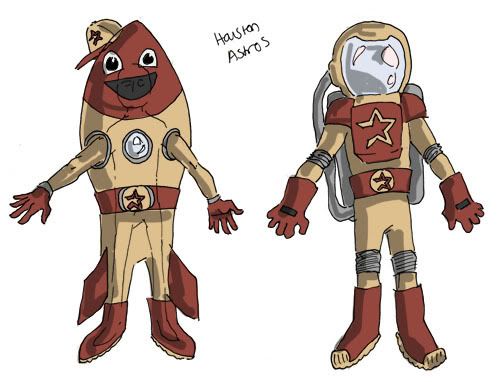
Do you see how RIDICULOUSLY EASY it would be to have a dude in an Astros-colored astronaut suit running around out there? Or even how easy an aggressively goofy rocketship in Astros colors would be? Both of these would make SO much more sense than a sleepy-eyed rabbit manbeast that it's not even funny, except in that "ha ha oh god nervous laughter" kind of way.
For the record, I am a big fan of things that shouldn't have arms or legs having arms and/or legs sticking awkwardly out of their bodies but clad in similar-colored spandex so that everyone knows they should be assuming they're a part of the costume. Donuts... coffee cups... hot dogs... space shuttles.
the Devil Rays
If you recall, the current mascot is Raymond, seen here making terrifying eye contact with the cameraperson.
The more I think about Raymond the more OK I am with him as a mascot. He just misbehaves too well, by which I mean that he torments the other team during BP, he goes out of his way to interact with fans, he runs over tiny stuffed versions of rival mascots in toy cars, etc. That's what you want in a mascot, and I give Raymond credit for doing his best.
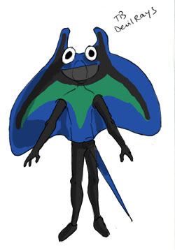
HOWEVER. This does not satisfy me, because when I see a team name that IS AN ANIMAL, I want to SEE THAT ANIMAL AS A MASCOT. There is no giant plush devil ray, and this strikes me as a deep wrongness. So.

You can see how a person would wear this. The 'wings' would be stiff foam, I guess, or whatever it is that makes Lefty and Righty's protruding sock appendages possible. The tail would be stiff and would stick out the back, while the mascot-suit-wearers limbs would be all black spandexed up and would have pretty good freedom of movement.
Yes, it would be bad news going through doorways, but since when are mascots supposed to be practical? At least they don't have to deal with oversized clown shoes and giant unwieldy paw-hands. And the eyes (which Devil Rays do not have, but a mascot would need, so the children know where to poke it) could be googly eyes, so when he danced around they would jiggle all over the place and it would be a hilarious floppy chondricthian.
the Indians
Current mascot, again, is the abominable pink furman known as Slider.
Slider exists because nobody wants to see the mascot that would be based on the actual logo. Can you even imagine? A giant dancing bright red figure with a hooked nose, huge grin, and a feather sticking out of its headband... ugh, I can barely even type that. Which is maybe a sign that you need to CHANGE YOUR LOGO, CLEVELAND.
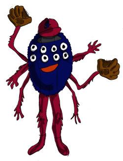
Personally, I think that Cleveland's best bet is to go back to the days of baseball in Cleveland BEFORE there were the Indians, which means going back to the Cleveland Spiders.
Pros:
-getting rid of Chief Wahoo
-embracing history
-spiders are cool, different (when it comes to mascots), and scarier than, say, orioles
-TONS of new merchanidising opportunities!
-no longer having to be embarrassed to market your team logo
-positive press for getting rid of a longstanding racist image
-losers are cool (look at the Sox pre-04, and the Cubs now)... the Spiders are the holders of the worst record in baseball history
-ability to get rid of the pointless and alarming Slider
Cons:
-having to revamp an entire team brand
-having to do the work to get new logos/mascot designs/uniforms/etc. made and approved
-idiots who claim that history is important to preserve even when it's wildly offensive
-necessity of having the chutzpah to make the change
I don't really see an argument.

I'm not sure if you can see the outline there, but the suit fits so that two of the spider legs are the person's real legs (in red spandex) and two of them are the person's real arms, similarly attired. I did try to make him as goofy and nonthreatening as I could, since some people are irrationally afraid of spiders, but my mother still claims that the 8 eyes are not cool. I think a giant fuzzy blue and red spider dancing up to you with 8 possibly googly eyes staring in 8 different directions would be AWESOME, but maybe that's just me.
the Diamondbacks
For reference, the current mascot, Baxter the bobcat, in his old uni.
Aside from the problems relating to the fact that Baxter looks like a furry, this is another team with an animal name that DOES NOT USE THAT ANIMAL AS THEIR MASCOT. Why. Whyyyyyyy. Is it because they thought a snake would touch off some people's snake phobias? Because let me tell you guys, they have snakes already in their logos. See? Snake. And check it out, this is their sleeve patch: more snakes (I actually REALLY like this logo, it's a glorious success of graphic design and I could write a whole separate article about how good I think it is. But that's for another time).
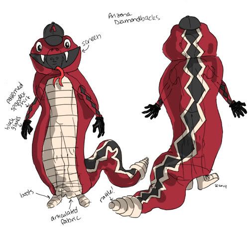
So the snake phobic ship sailed a long time ago, Arizona, and anyways, what about the people who have serious phobias of fursuiters? They're going to be just as perturbed by Baxter as they would be by a snake mascot. YOU ARE THE DIAMONDBACKS. THAT IS A SNAKE. EMBRACE IT.

This is the same mascot, just from the front and the back. He's friendly! He's goofy enough to count as a mascot and not terrify children! He doesn't look like a sexual fetish! HE'S ACTUALLY A SNAKE!
I think children would love this. Two of my favorite stuffed animals from my childhood were snakes: one was a snake made out of ties that I think my grandmother sewed for me, and one was a big fuzzy cobra that is in fact still sitting up on top of my dresser, along with a giant cheetah pillow I made myself, and a sock monkey. Snakes are awesome. Bobcats are SO overused as a mascot... how many college teams are the bobcats? They're probably only overrun by the wildcats, which are even more ubiquitous. You have a good mascot potentially right there in your lap, Arizona.
I'm still trying to decide which would be better for Seattle: a giant compass, or a seafaring dude in the style of Bernie Brewer. And I'm thinking about the White Sox. Suggestions welcome.Labels: baseball, drawn, mascot, MLB, rant
3:19 PM
|
|